
Collibra is a leading Data Intelligence company that provides organisations with a platform to manage, catalog, and understand their data assets. Collibra released a new beta user interface (UI) with release 2024.02, which contains various improvements and changes towards the previous UI. The latest UI introduces features like customisable theme settings for admins, a layout editor for asset pages, an auto-saving feature, and a new AI Governance view.
A user-friendly UI is crucial for software like Collibra, as it directly impacts user adoption and productivity. A well-designed interface enhances overall user experience (UX), making it easier for users to navigate, understand, and use the software’s functionalities. This, in turn, supports effective Data Management within organisations, by encouraging consistent use of the platform.
In this blog, we outline several topics regarding the new UI, such as:
- What are the differences between the previous, and the new UI?
- What customisations can be done?
- How can current users easily adapt to the new UI?
Collibra’s latest UI enhancements simplify the Data Management experience for business- and technical users, and make the platform more accessible and suitable to modern design aesthetics.
Summary of Collibra’s previous UI/UX
The previous UI/UX of Collibra was structured to facilitate Data Governance and Data Management with a focus on functionality and comprehensive data handling capabilities. It provided users with various features like data asset management, data cataloguing, workflow management, and various integration options. The interface, while functional, was considered somewhat dated, with less emphasis on modern design aesthetics and user customisation.
Strengths of the previous design:
- Thorough functionality: extensive features for Data Governance, including workflows, data cataloguing, and asset management.
- Structured flow: clear and structured flow to manage data-related tasks and processes.
- Consistency: consistent layout across different modules, which helped in reducing the users’ learning curve for the new module.
Weaknesses of the previous design:
- User experience: the user interface was less intuitive and required a steep learning curve for new users.
- Customisation limitations: limited options for UI customisation, making it difficult for organisations to align the platform with their brand identity.
- Aesthetics: the design was functional, but lacked modern aesthetic elements that enhance user engagement and satisfaction.
- Performance issues: some users reported performance issues, particularly with loading times and responsiveness.
Key features and Changes in the new UI/UX
There are various changes in the new UI, in comparison to the previous UI. On the left side (or top on mobile view), you see the previous UI design. On the right side (or bottom on mobile view), you see the new UI design.
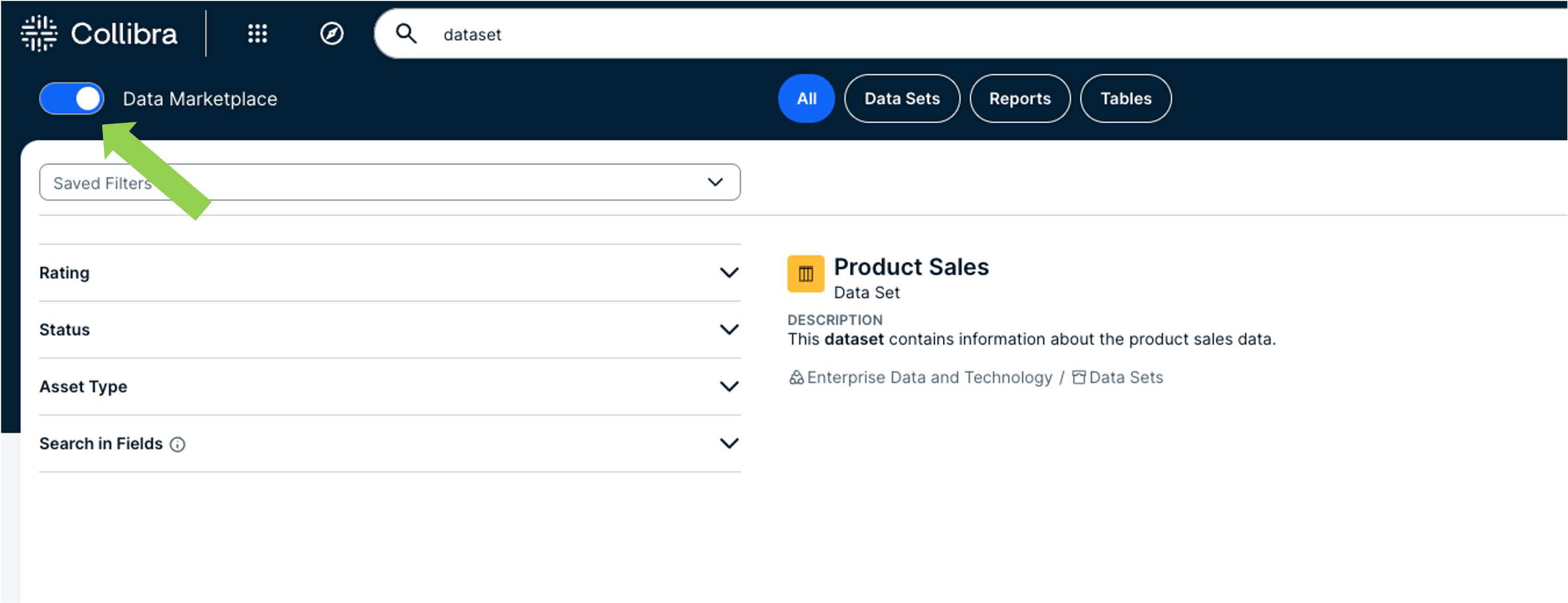
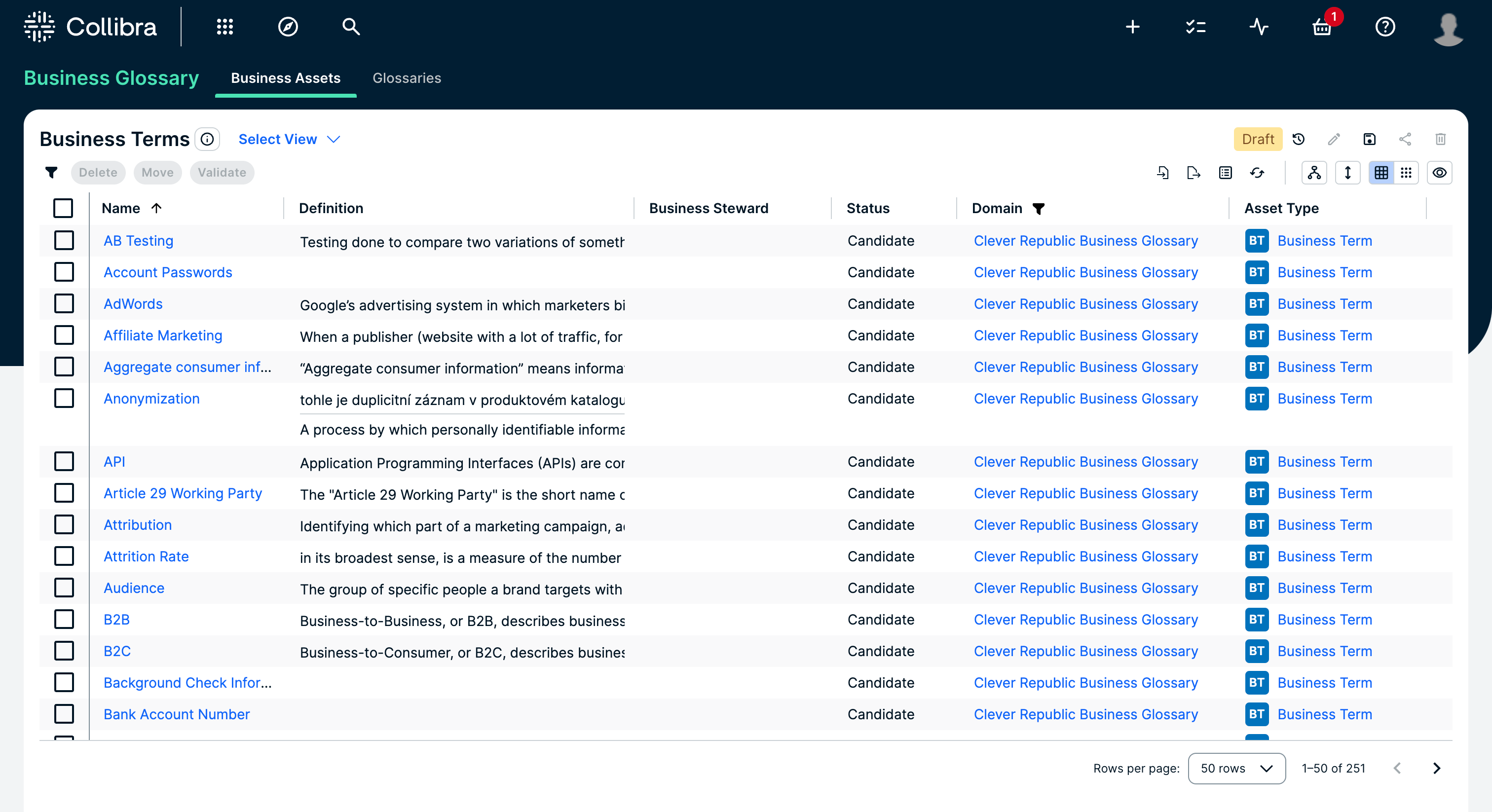
Unified search experience
One of the standout features of the new UI is the integration of the Data Marketplace into the search page. This enhancement allows users to seamlessly toggle between a global search of all resources and a curated search within specific datasets. The unified search experience ensures that you can find the data you need more efficiently.
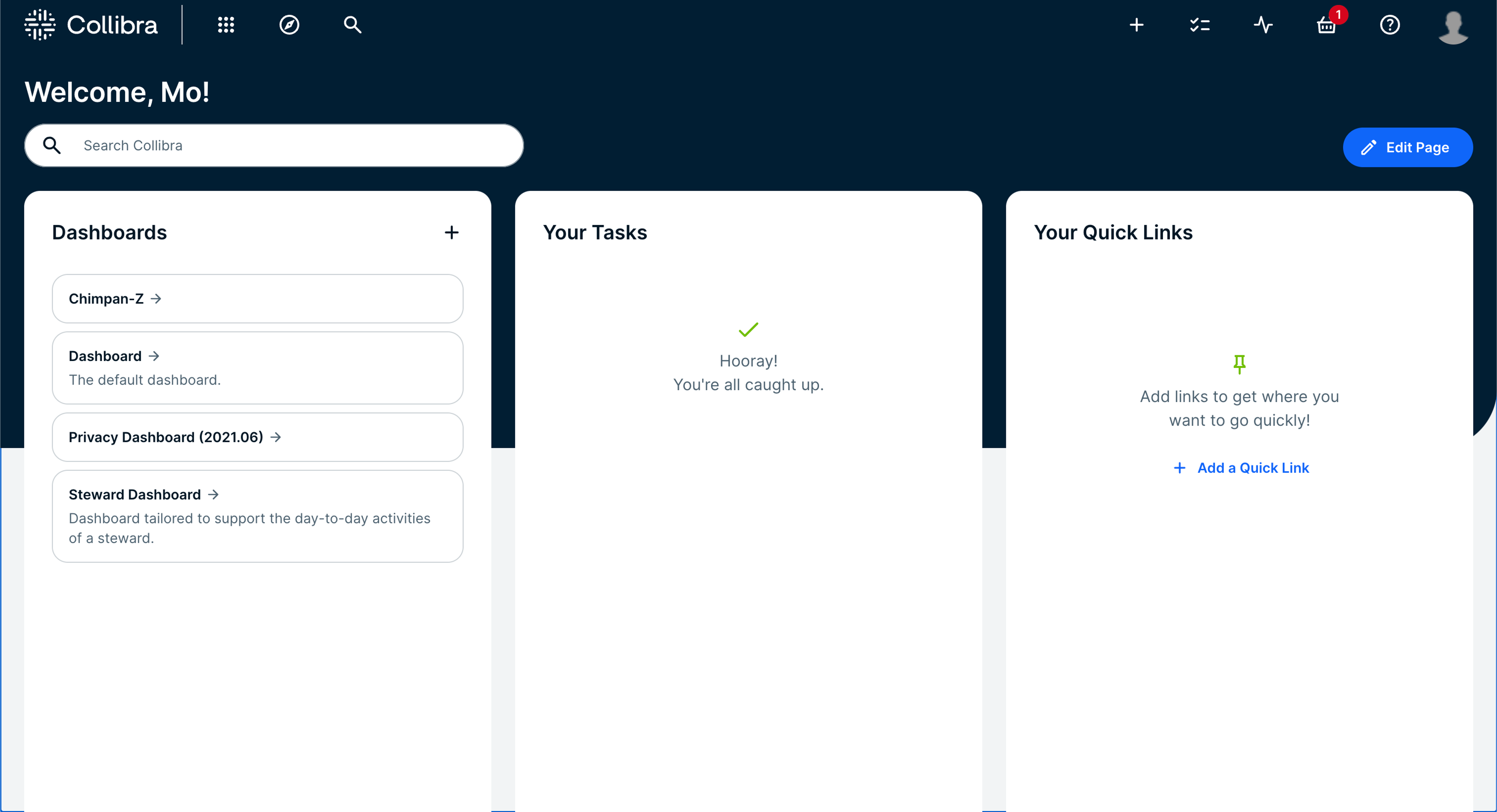
Landing Dashboard (previous UI):
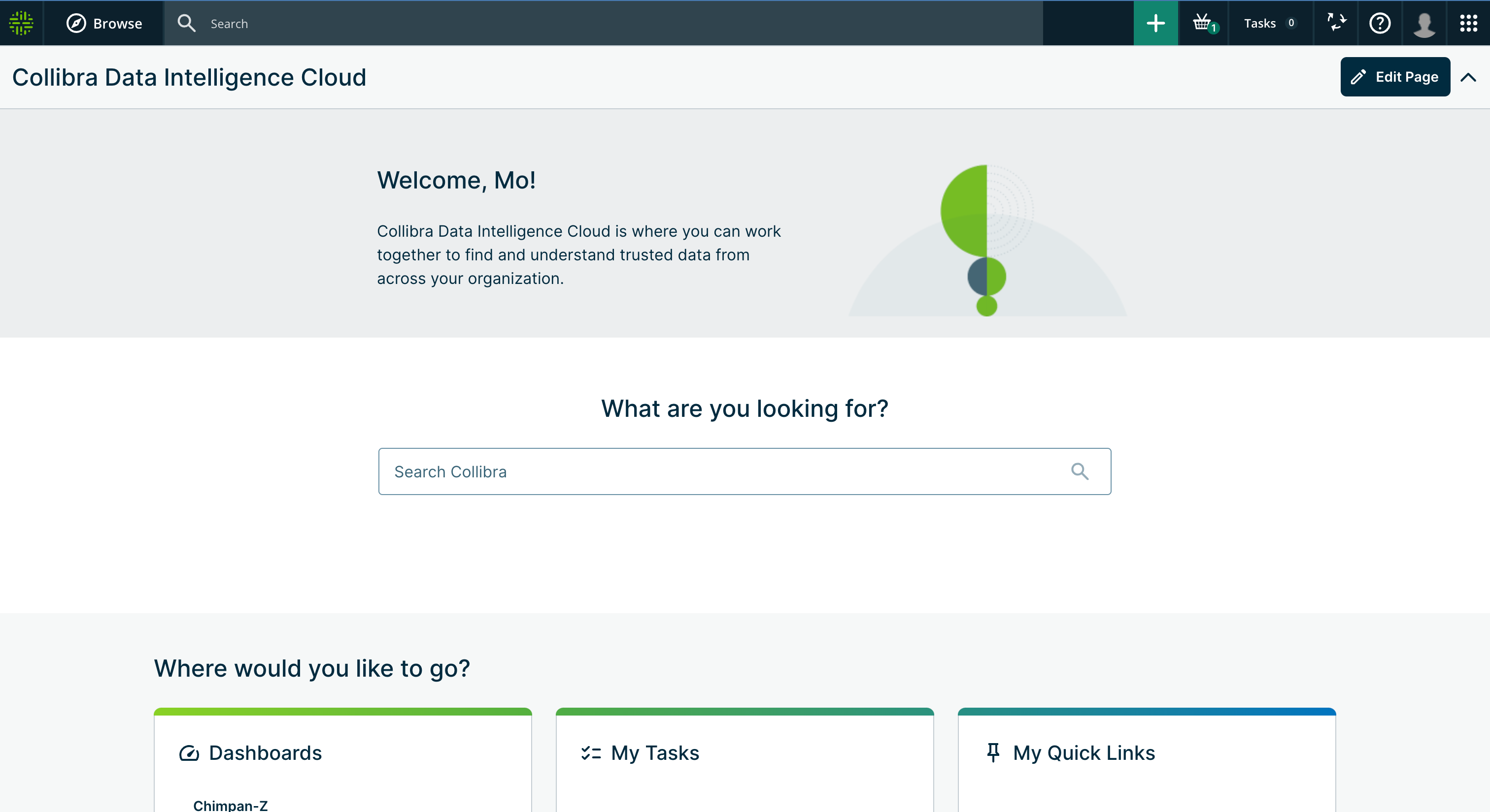
Landing Dashboard (new UI):
Data Marketplace toggle integrated in search bar on Landing Dashboard:
Customisation capabilities
Collibra’s new UI introduces new customisation options. Admins are now able to adjust the platform’s appearance to match their organisation’s branding. This includes customising the theme, logos, and brand colours directly from the Collibra settings page. Additionally, the new Asset page layout editor enables admins to modify the layout of asset pages by adding, moving, or removing characteristics and organising sections with a simple drag-and-drop interface.
See more about the customisation capabilities below.
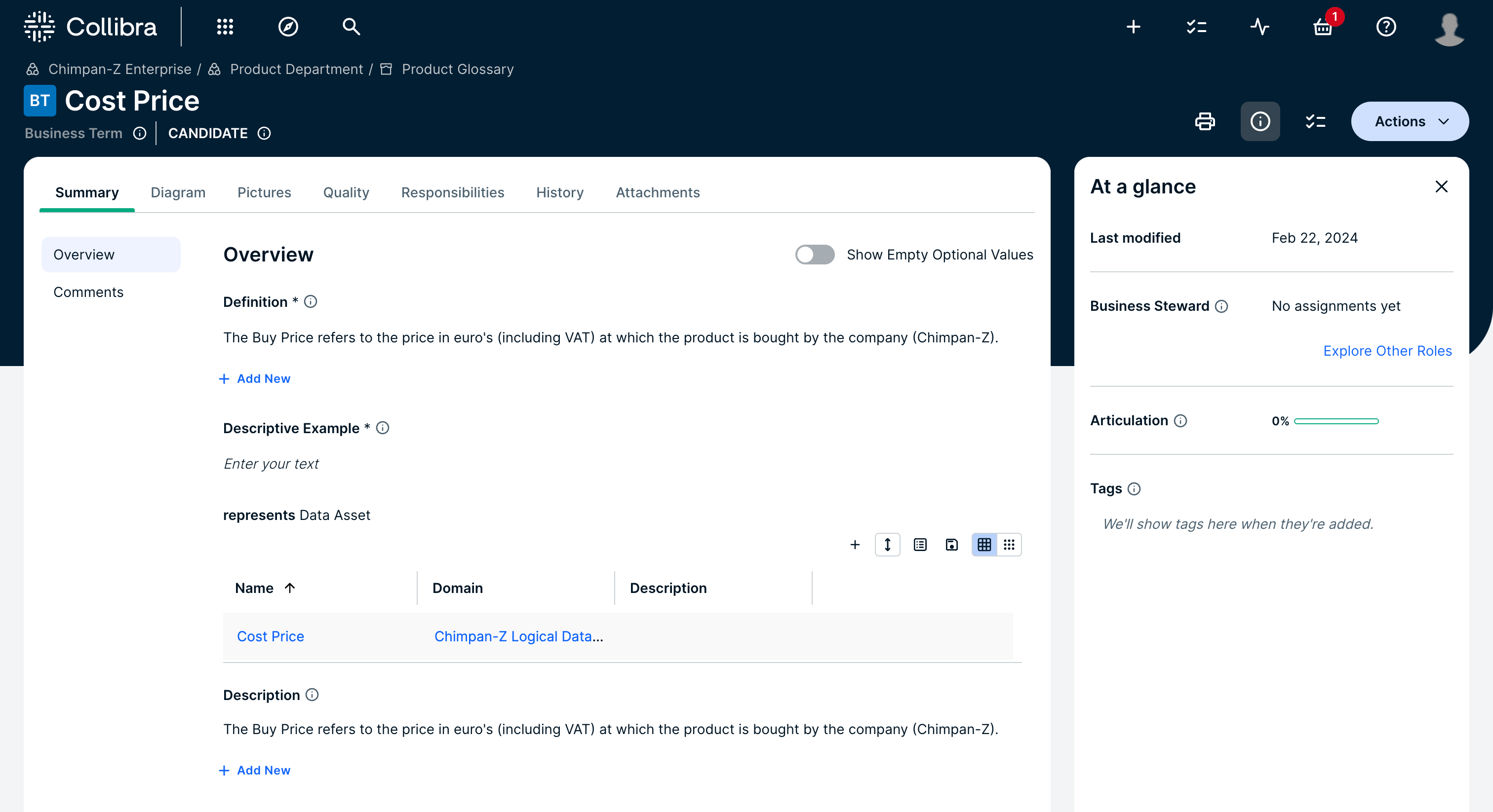
Enhanced editing and viewing
The new UI significantly enhances content editing and viewing. Users with author roles can now edit content directly on the asset page, making the editing process more intuitive and streamlined. The new “At a Glance” sidebar provides quick access to essential asset information, such as the last modified date, assigned colleagues, and asset tags, making sure that that key details are always easy to see.
Asset Page (previous UI):
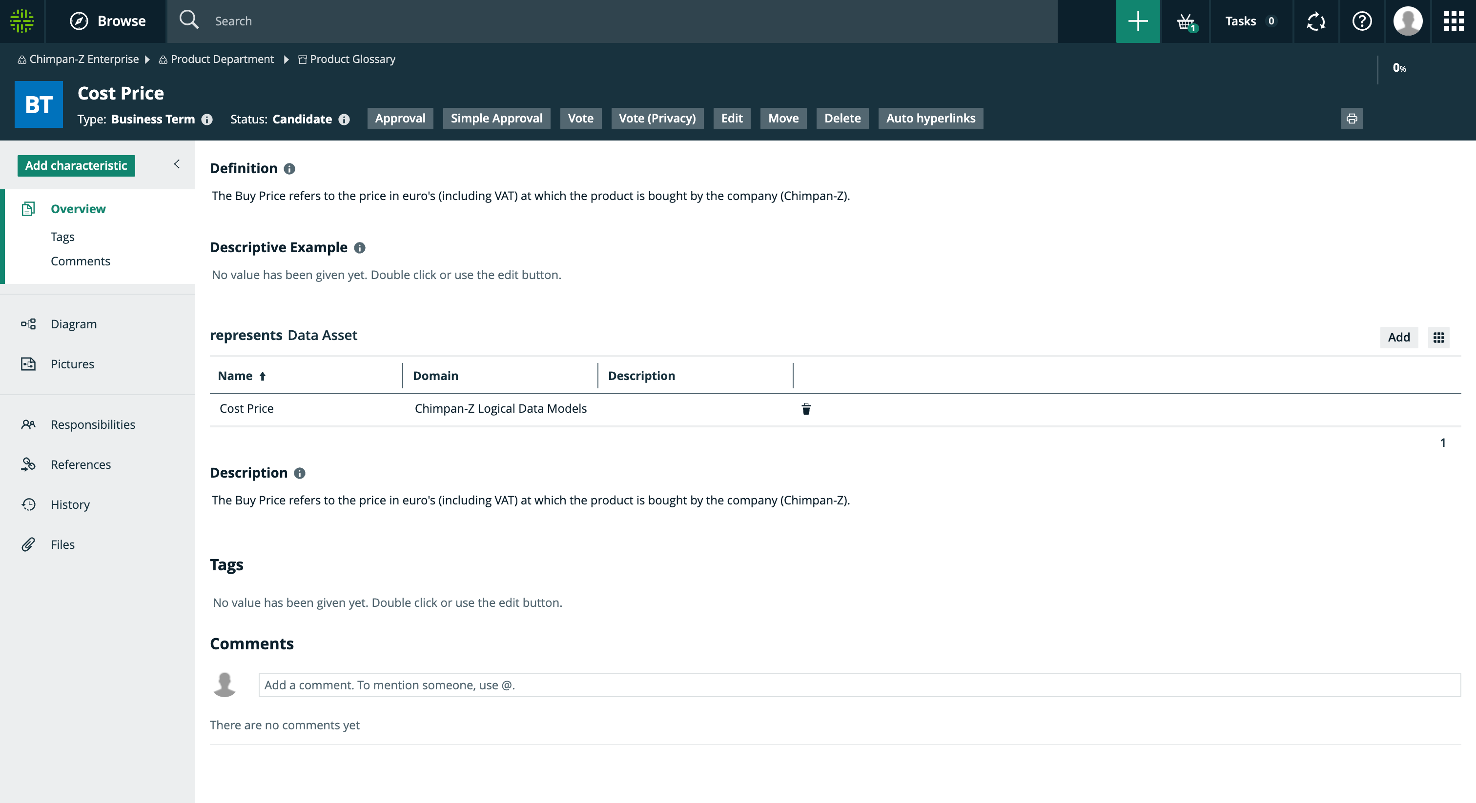
Asset Page (new UI):
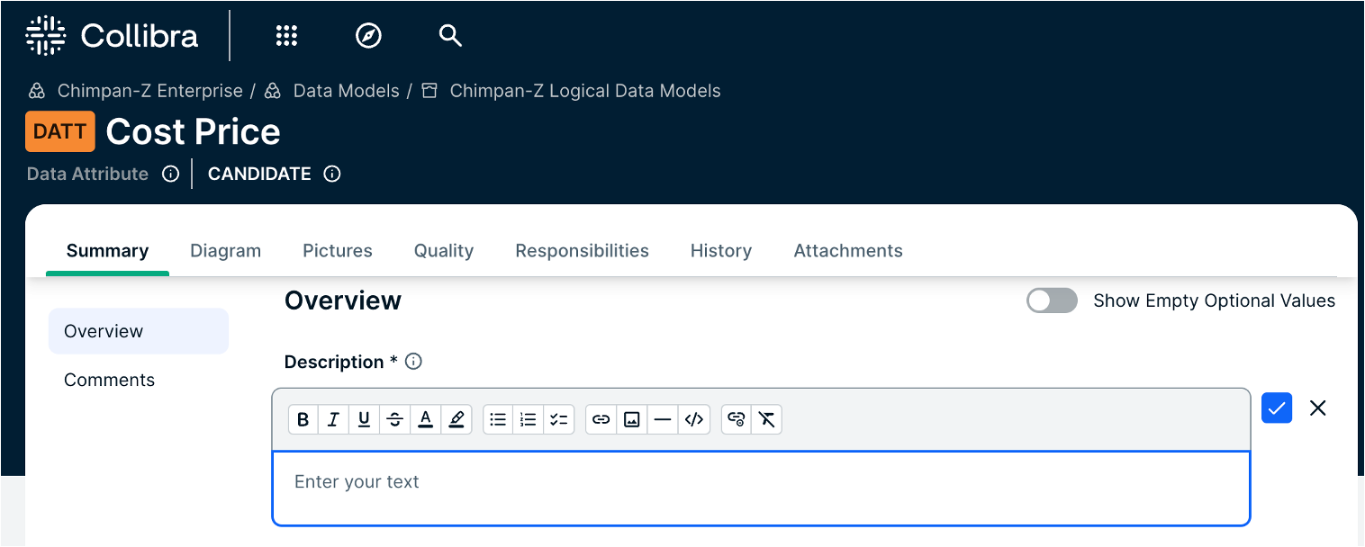
Updated text editors
The text editing experience in Collibra has also received a major upgrade. The new text editors maintain HTML markup, which means that you can now add layout and styling in text boxes. This update provides an intuitive editing experience. Users can enjoy advanced editing options, including various paragraph styles, code blocks, and the ability to upload images directly from their computers.
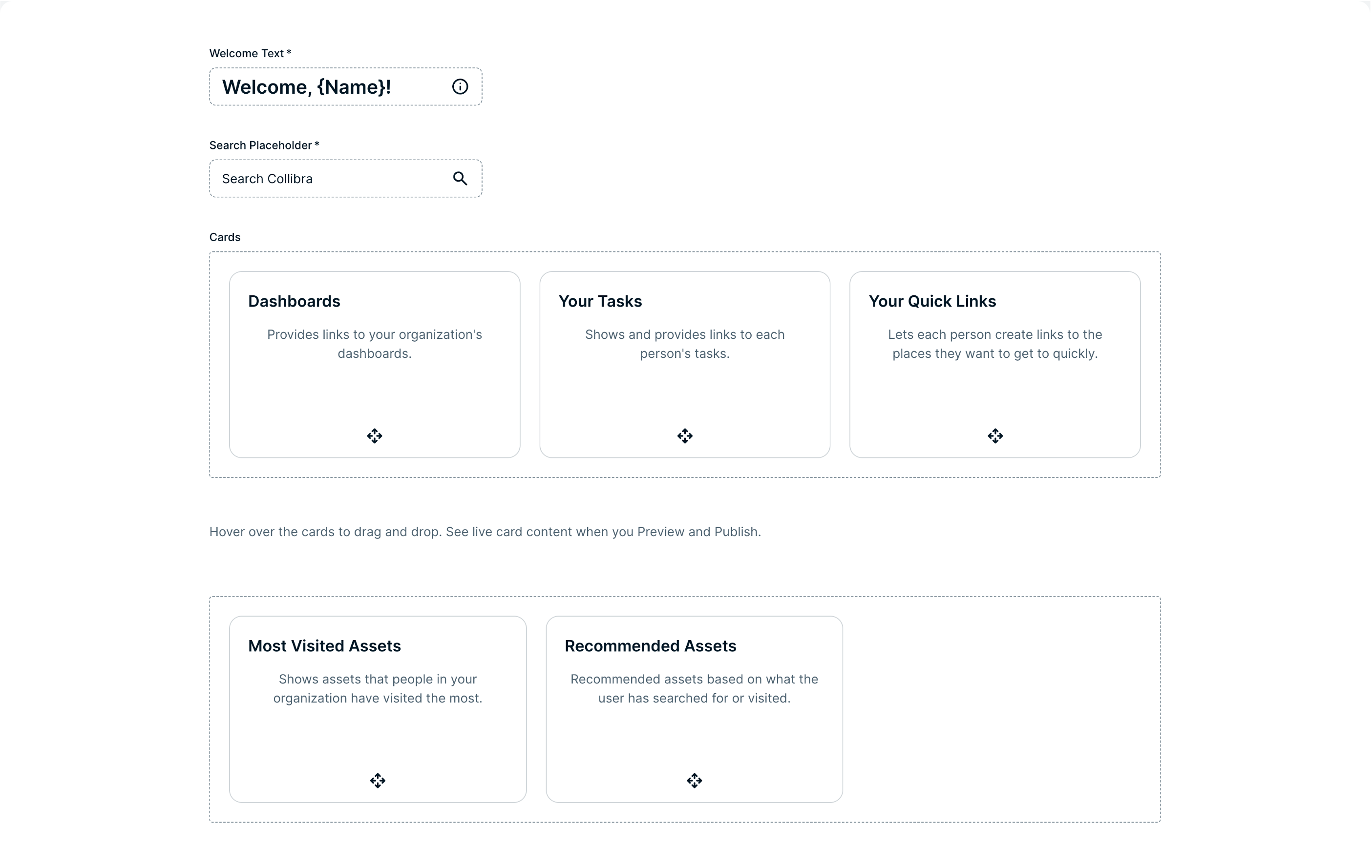
Improved dashboard and widget management
Creating and managing dashboards has never been easier. The latest UI allows for seamless dashboard creation and editing, with improved widget management and layout customisation. New packaged widgets, such as the embedded webpage widget, and renamed widgets, like tasks and issues (formerly to do), provide more flexibility and functionality for dashboard users.
Refined views and tables
Working with tables and tiles is now a more user-friendly experience, thanks to enhanced functionality and improved interaction. These updates ensure that managing and viewing your data is more intuitive and efficient.
Table View (previous UI):
Table View (new UI):
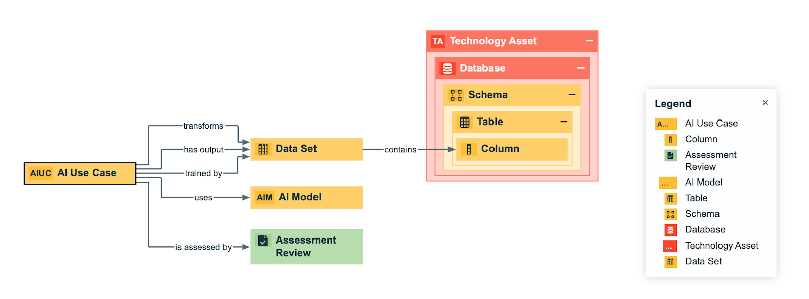
Collibra AI Governance
The new UI also introduces Collibra AI Governance, which offers users the opportunity to participate in beta testing. This feature provides a comprehensive, end-to-end view of AI projects, with the ability to enable AI-driven description recommendations across various assets.
AI Governance asset model based on Collibra’s AI Governance module:
More on this topic in a later blog!
Enhanced integration and configuration
Integration and configuration have been streamlined in the new UI. The management of data source credentials and connection properties through Edge Vaults are now more efficient. Improvements to S3 and Databricks integrations simplify the configuration process, making it easier to manage and synchronise data sources.
With these substantial improvements, Collibra’s new UI/UX not only enhances the platform’s functionality, but also provides a more engaging and intuitive user experience. Explore the new features and see how they can transform your Data Governance processes.
Other improvements
To see the visual improvements of other functionalities such as the Data Marketplace, the Catalog, Global Views, and Diagram Views, please refer to the attached PDF-file.
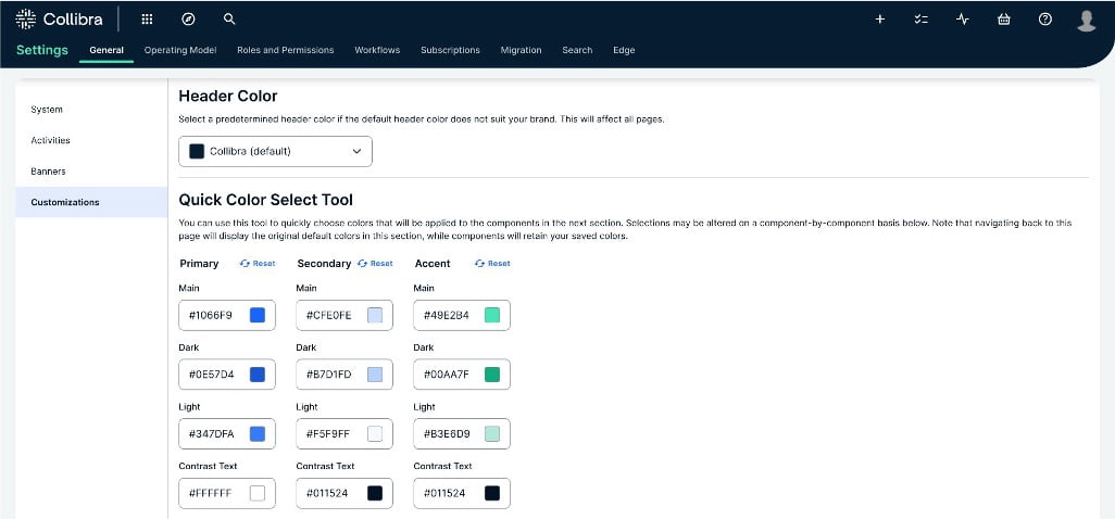
User-Centric & Custom
With the release of the new UI, adjusting the software’s interface to the organisation’s style and branding is now a lot easier and more intuitive. Below, the features that can be customised via “Settings > General > Customizations” are outlined.
Logo
First, you can upload your organisation’s logo, in colour as well as how it should be shown on a dark background.

Header Color
This section allows you to change the header’s colour to one of the following colours: default, or grey.
Quick Color Select Tool
The colours that are shown in the ‘Quick Color Select Tool’ affect the components in Collibra. It is created to quickly change the look and feel of the overall UI. Changing colours in this section also automatically adjusts several colours in the components’ customisation settings (so, pay attention when changing these colours after changing the components’ colours).
There are four different quick selections to choose from, each with its own effects:
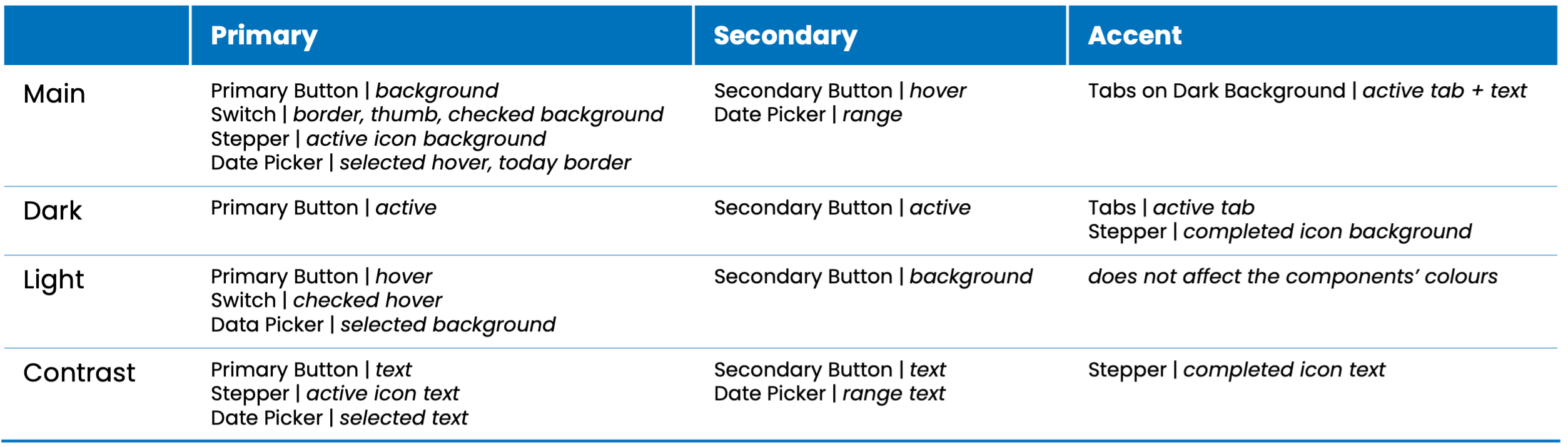
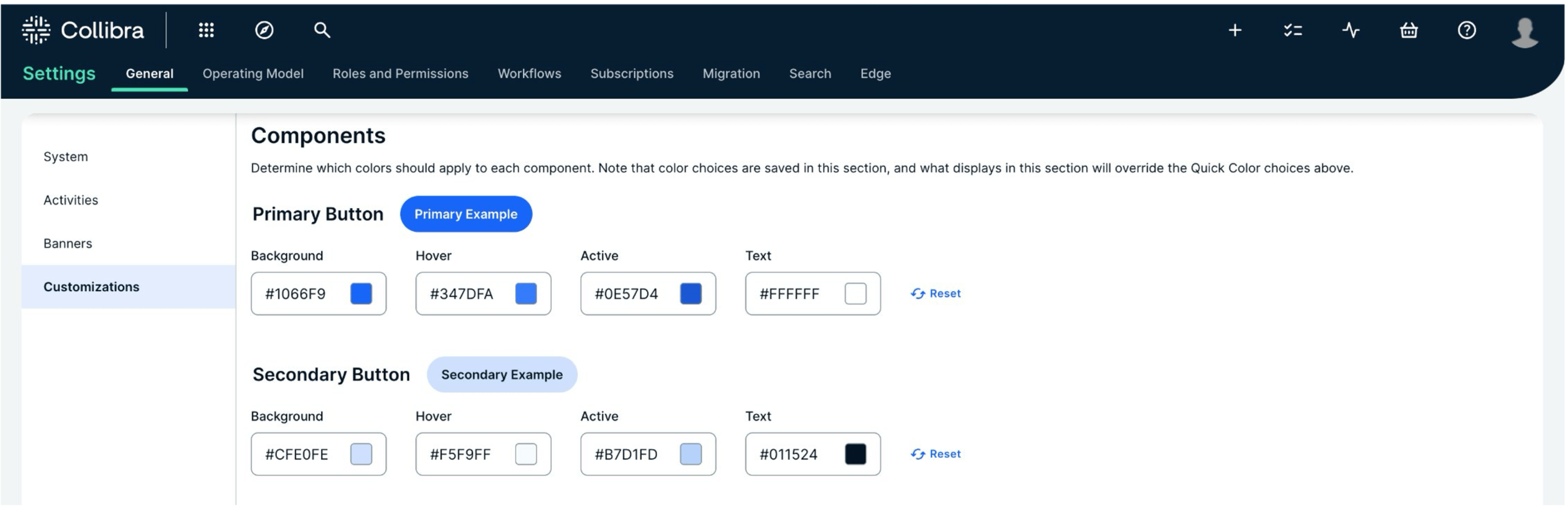
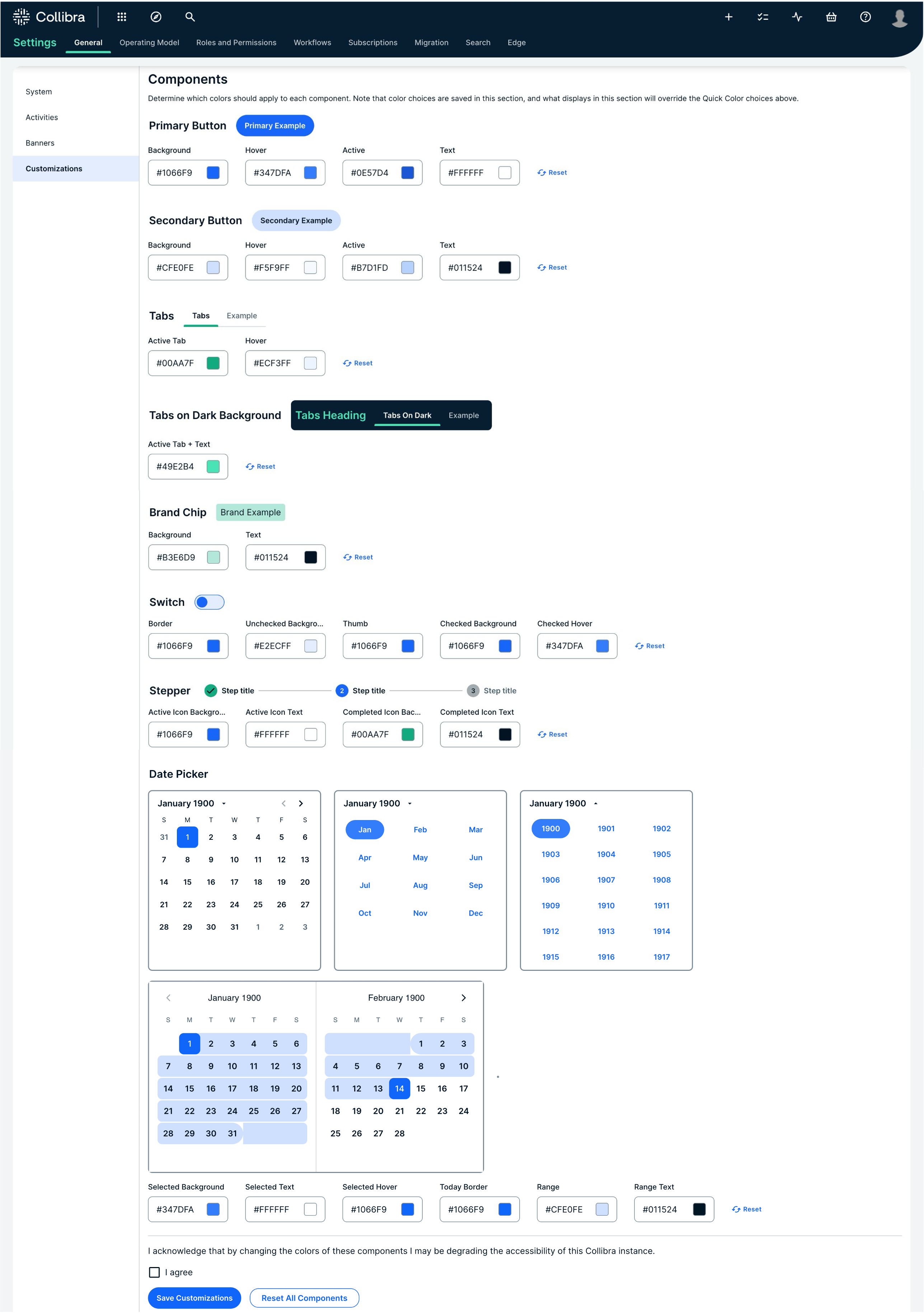
Components
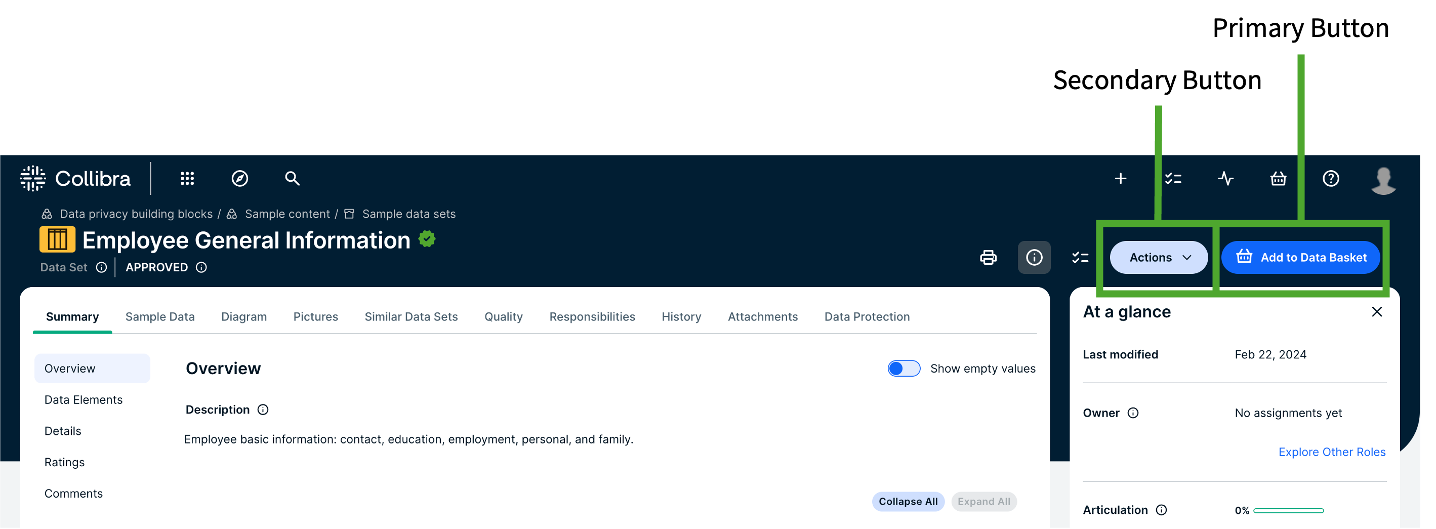
Primary & Secondary Button
The first component to change is the ‘Primary button’. The second component to change is the ‘Secondary button’. See an example of the ‘Primary’ and ‘Secondary’ buttons that will be changed below.
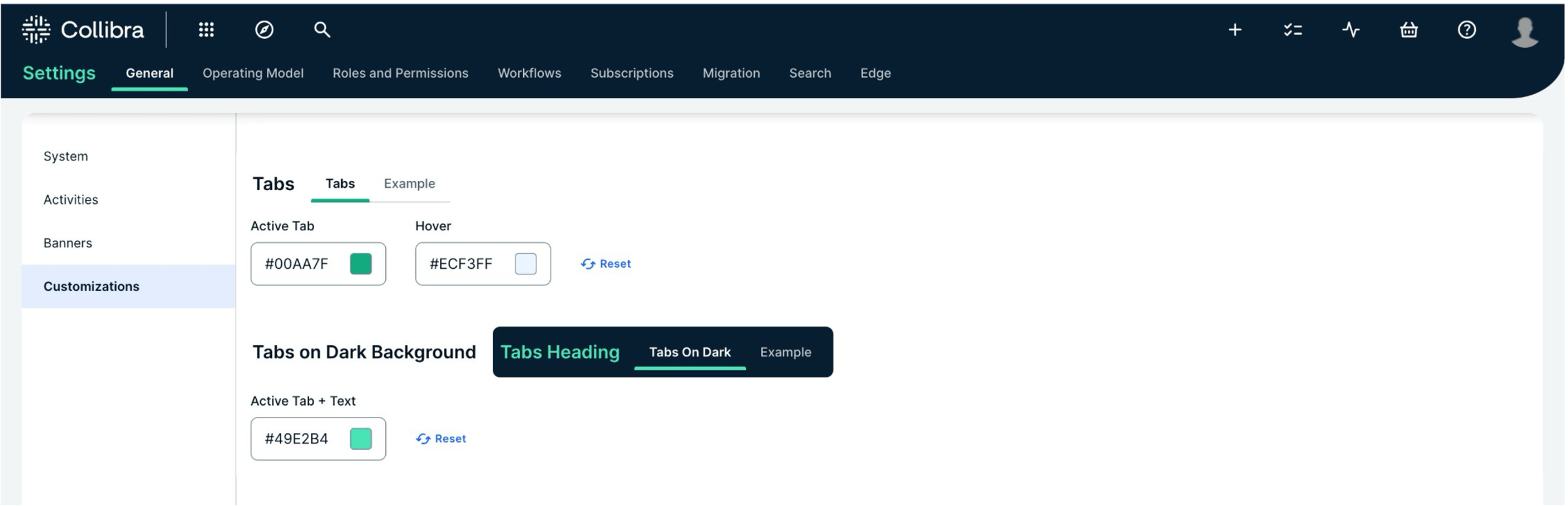
Tabs & Tabs on Dark Background
The third and fourth components to change are the ’Tab’ fields, on light or dark background. See an example of how the tabs (on a dark background) will be changed in the images below.

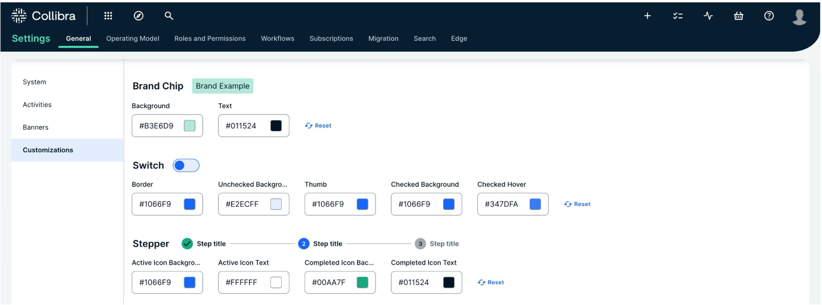
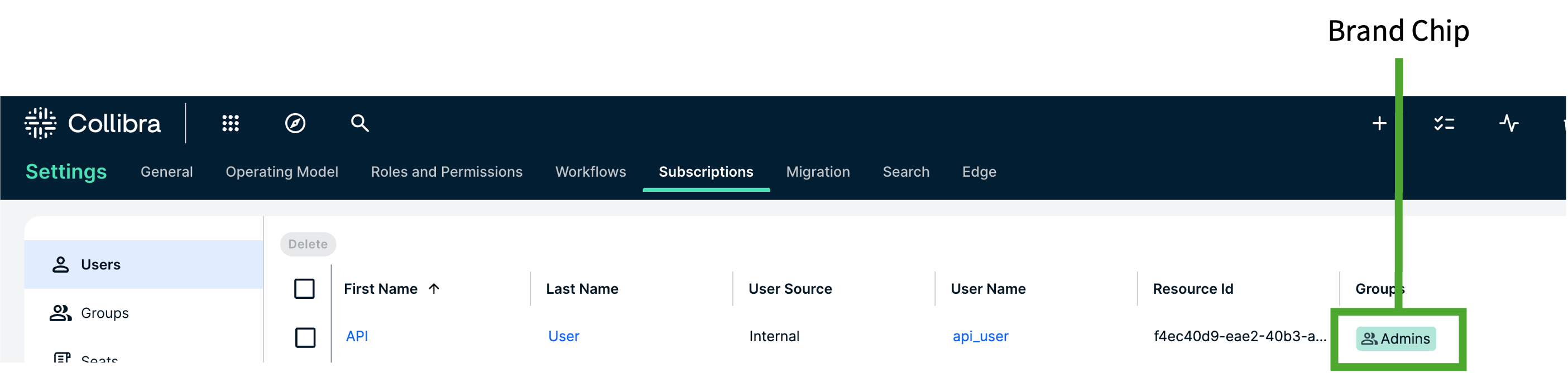
Brand Chip
The fifth component to change is the brand chip, of which an example can be seen below.
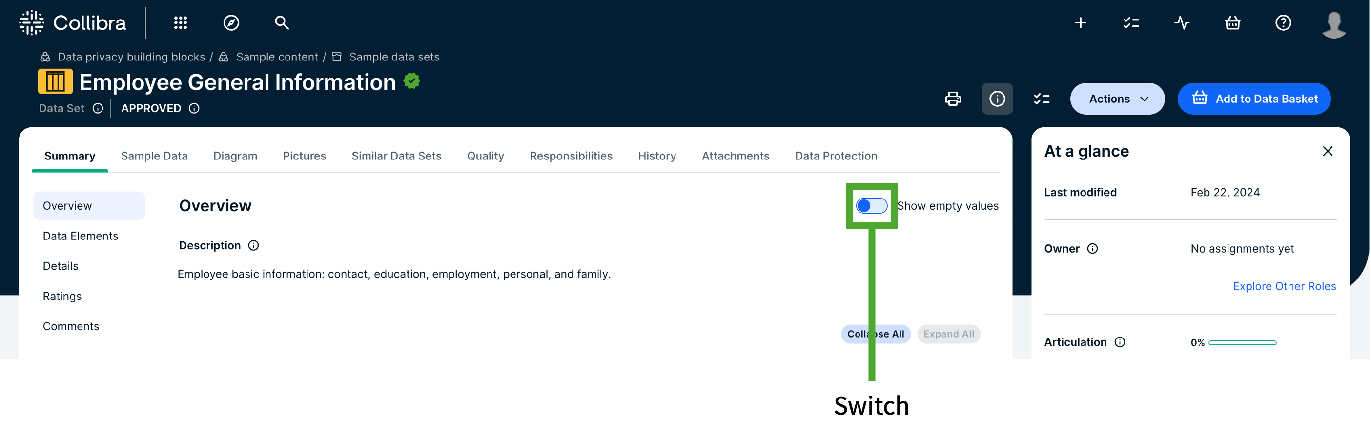
Switch
The sixth component is the switch. For example, the one used to show empty values on an asset’s asset page, as can be seen in the image below.
Stepper
The stepper shows you different steps in a process. Also these colours can be changed.
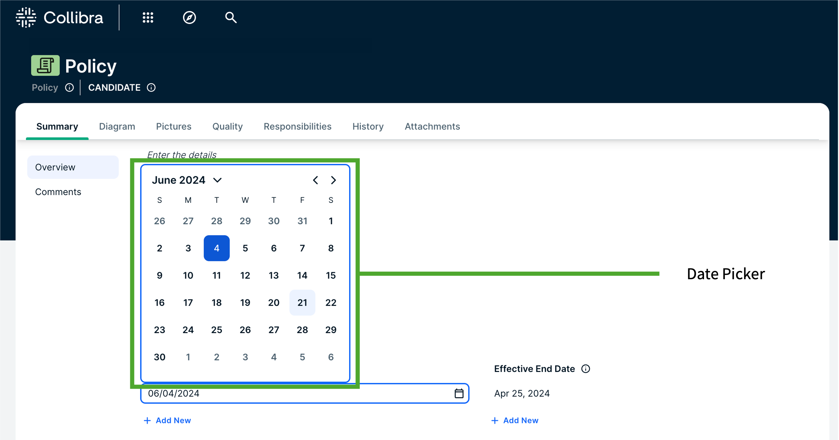
Date Picker
The final component that can be changed is the date picker. An example of what this affects in Collibra can be seen in the images below.
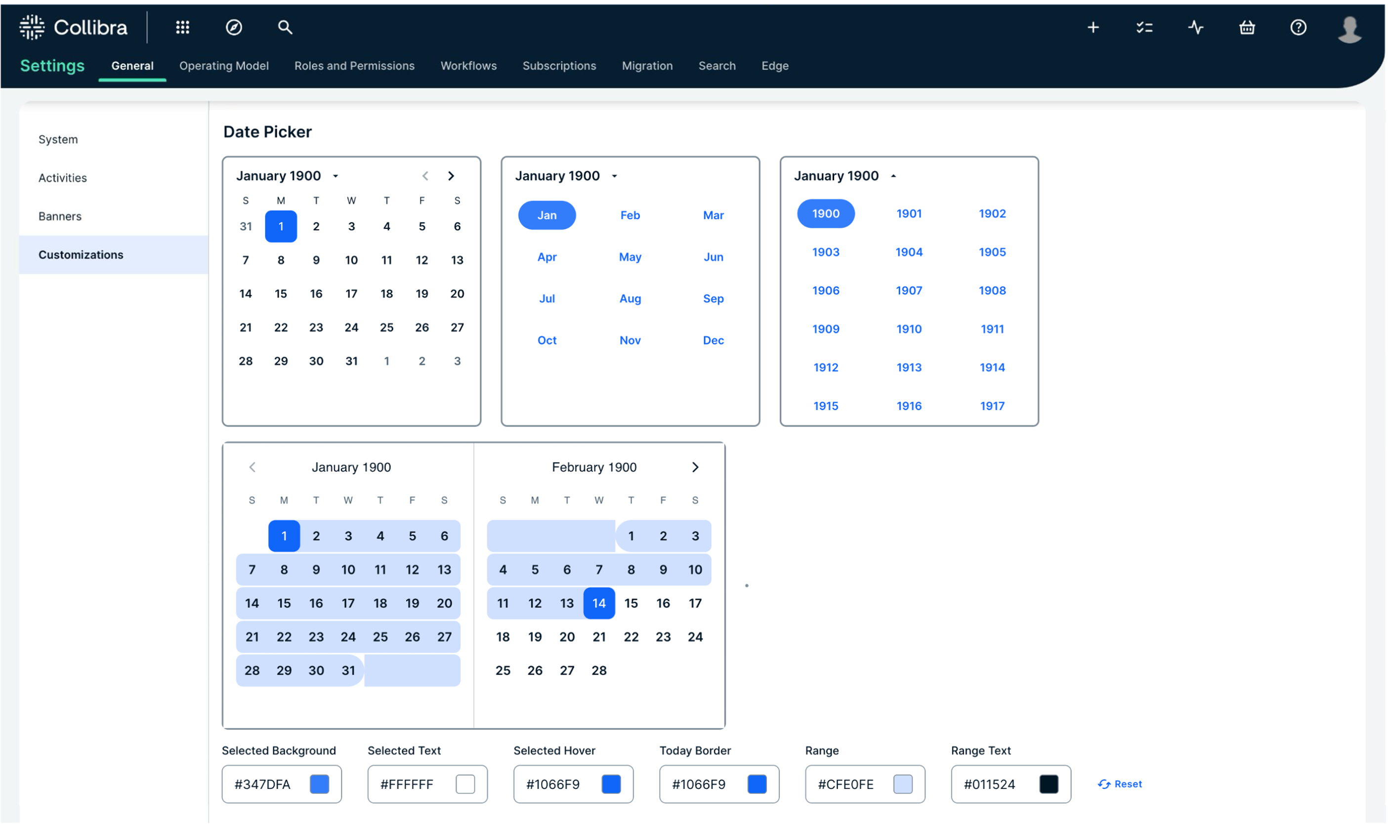
Summary of the components:
User Adoption & Training
The release of the new user interface brings enhancements designed to streamline and elevate your Data Management experience. As a consultancy firm dedicated to ensuring successful Collibra implementations, that drive business value, we understand that adapting to these changes can be quite complex for some users. To ease the transition to and maximise the benefits of the new UI, we offer the following recommendations and tips:
1. Leverage customisation features
- Theme & branding: start by customising the theme to align with your organisation’s branding. Update the logo, adjust header colours, and use the Quick Color Select Tool to personalise the overall look and feel of the UI. This helps create a familiar environment for users, encouraging adoption.
- Asset page layout editor: take advantage of the drag-and-drop interface to tailor asset pages according to your needs. By organising sections and moving characteristics to suit your implementation preferences, you can enhance usability, consistency, and efficiency.
2. Use the unified search experience
The updated unified search feature includes the Data Marketplace directly on the search page, enabling seamless switching between global searches and specific curated data sets. Encourage users to explore this functionality to accelerate data discovery and usage.
3. Explore enhanced editing and viewing capabilities
In-page editing: if you have the Author role, use in-page editing to add and modify content directly on the asset page. This reduces the steps needed to update information, thereby improving efficiency.
New sidebar: use the “at a glance” sidebar to quickly access key information such as the last modified date, assigned colleagues, and asset tags. This feature helps to maintain up-to-date data and efficient team collaboration.
4. Take advantage of improved dashboards and widgets
Experiment with the enhanced options for creating and editing dashboards. Rename and resise widgets to better display relevant information. New widgets like the Embedded Webpage and To Do (Tasks and Issues in the previous UI) offer greater functionality and customisation for tracking tasks and visualising data.
5. Resources and training materials
To support your transition to the new UI, we developed training materials and resources. These resources are designed to assist organisations implement their personal branding in the new UI, and to help users navigate the changes effectively and harness the full potential of Collibra’s latest enhancements. Visit our training page to:
→ book a tailored training
→ get in touch
Access our trainings.
By leveraging these resources and following the recommendations outlined above, one can ensure a smooth transition to Collibra’s new UI/UX, ultimately driving more effective Data Management within the organisation.
Key take-aways
- Enhanced customisation: the new UI allows for greater theming and customisation, aligning the platform with organisational branding.
- Improved user experience: in-page editing, better text editors, and a unified search experience contribute to a more intuitive and efficient user experience.
- Advanced features: introduction of Collibra AI Governance, enhanced integration configurations, and new dashboard functionalities.
- Explore, adjust, and train: we encourage all Collibra users to explore the updated UI and experience the new features firsthand.
Want to know more about Data Governance?
Curious to know all the ins and outs of Data Governance? On our website you will find all recent developments regarding Data Governance.